WalkMe Visual Editor
Overview
WalkMe builds an adoption layer that sits on top of a customer’s application - onboarding flows, guidance, shoutouts, surveys - added without touching the host app’s code.
The mobile version of that layer needed an editor. A customer had to design an artifact, place it over their own app, and have it render correctly on whatever device it landed on.
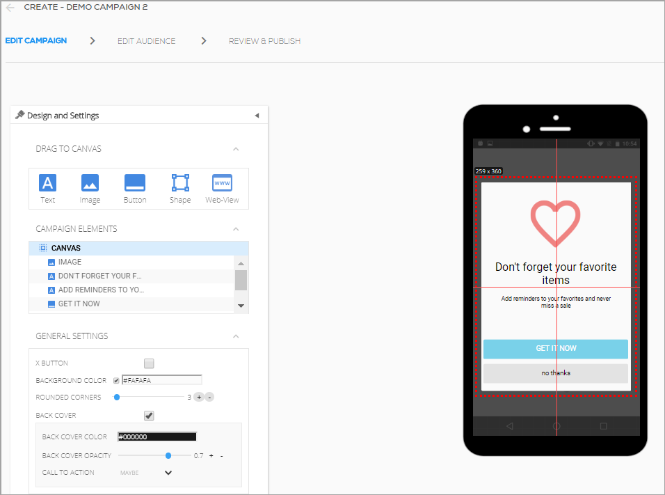
The old editor barely managed the first part. Its control over placement and behavior was limited, and the problems were as much functional as they were UX.
I led the design of its replacement - a WYSIWYG tool giving non-designers direct visual control over how an artifact looks and, more importantly, how it behaves across screen sizes.
The old editor
Audience
The people building these artifacts were rarely designers. In most companies it was a product manager; larger organizations investing in adoption had dedicated digital adoption managers; sometimes a marketer or an in-house designer.
Product managers were the primary persona, and that set the terms for the product. They know their own product deeply and design tools barely at all.
So every control had to be readable to someone who had never opened one, and predictable enough to be trusted without checking the result on ten devices.
Challenge
An artifact designed once has to hold across the entire spread of mobile - iOS and Android, phones from small to large, tablets - and sit correctly over a host application the editor does not control.
That is a difficult promise for a WYSIWYG tool. “What you see is what you get” works when the output has one fixed size. Here it never does.
The design tools of the period were no help, because they solved a different problem. Sketch, Adobe XD, and early Figma were canvas tools: a design-trained user drew a mock-up, engineers rebuilt it in code.
Our customers needed the inverse. The output had to be the component itself, compiled for three platforms - and the person producing it did not compose layouts for a living.
My Role
As Principal Designer I owned the design end to end - and much of the product definition with it. I set a large share of the feature set in equal partnership with the mobile product manager, not from a spec handed to me.
That followed from what we were building. In a design tool, functionality is visual behavior - what an object can anchor to, how much control the user is given. Product and design decisions were the same decisions.
Collaborators
The mobile product manager, and the mobile R&D team - developers and QA. On this product the line between what was designable and what was buildable moved constantly, so design decisions were checked against implementation cost continuously rather than at handoff.
Constraints
- One design, three codebases. Every behavior had to be built for iOS, Android, and web, within what each platform allowed.
- Feasibility. Some controls were reshaped or dropped because the cost of building them outweighed what the feature returned.
- Non-designer users. The primary persona had no visual design background, which ruled out most conventions professional design tools rely on.
Design Process
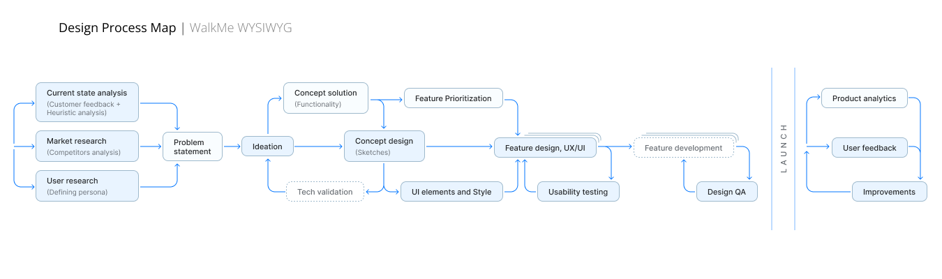
The tool shipped in two versions, and the second came directly out of what the first one taught us: control and freedom are not the same thing as usability.
01
Research and problem framing
We collected customer feedback on the old editor, ran heuristic evaluations, studied competing adoption platforms, and defined the personas through user research. The finding was consistent: its limits were not only in the interface but in what it was capable of producing at all.
02
Concept directions
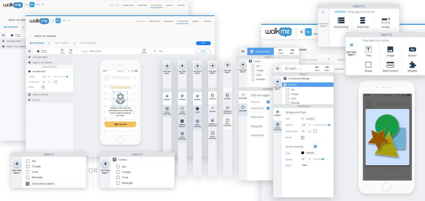
We worked through layouts for the tool itself - how to divide the control areas, where the artifact preview sits, how the panels relate to one another and to the canvas.
03
UI elements and the design subsystem
WalkMe had a design system, but this product needed elements that did not exist in it: canvas controls, positioning inputs, object hierarchy, alignment tools. What we built amounted to a subsystem of its own - components, sizes, layout rules, and behavior specs.
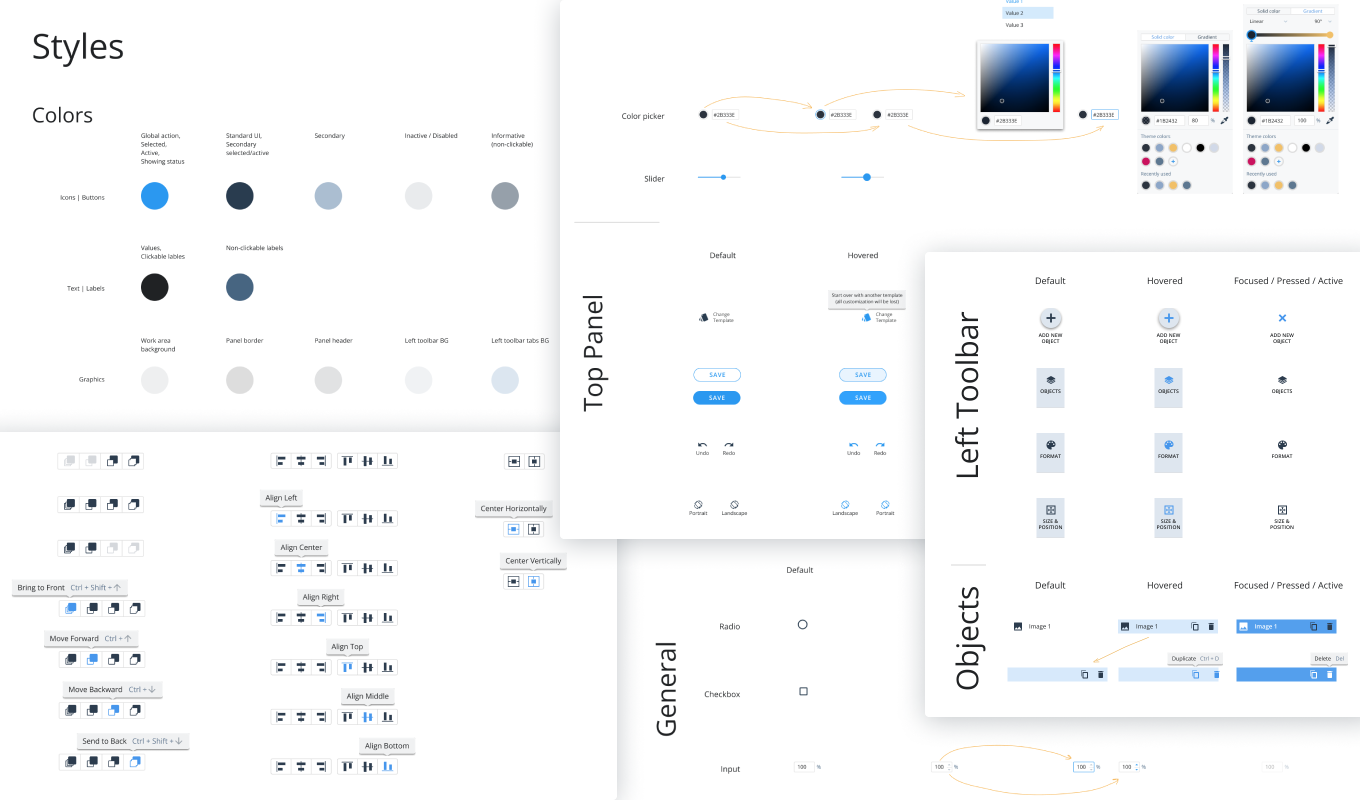
04
Version one - control over behavior
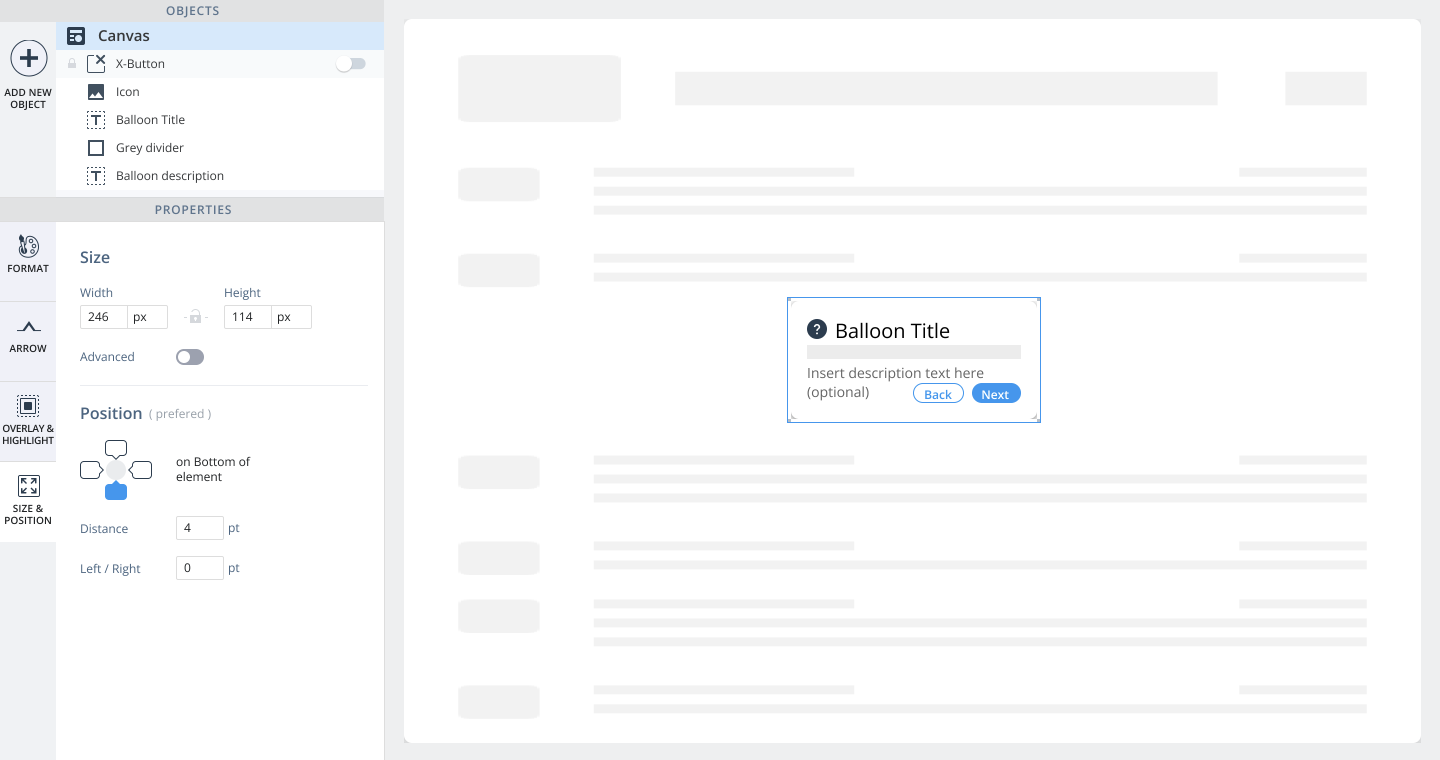
The first release kept absolute positioning: users placed objects freely on the canvas, as they had before. What changed was how much they could say about what happens afterwards.
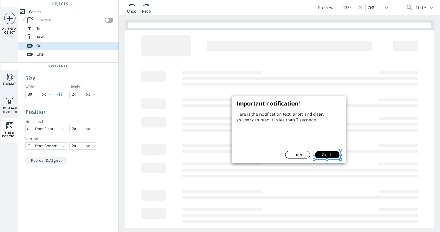
Sizes could be set in pixels or percentages. An object could be anchored to one edge of the canvas or to several, sized fixed or flexible, scaled, stretched between two edges, or centered.
Together these turned a placement into a rule the renderer could apply on any screen - which is what made one artifact viable across the whole device spread.
No design tool of the period offered that combination, and none needed to: a mock-up never has to survive a device it was not drawn for. Ours did, on every device our customers’ users happened to own.
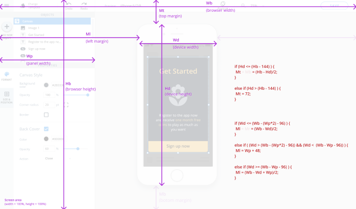
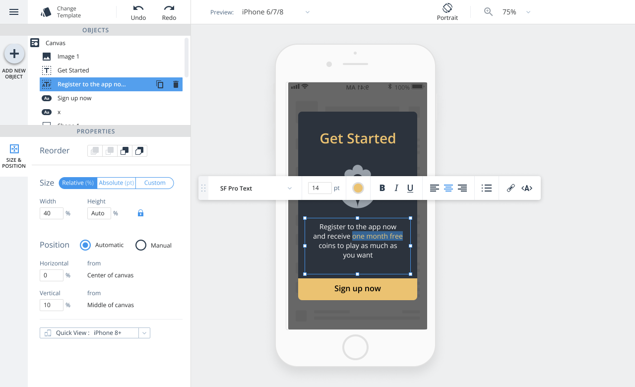
It was received well: a large functional expansion over the old editor, and easier to operate despite doing considerably more.
05
Version two - auto-layout
The first version then revealed a problem of its own making. That freedom served people who think structurally about layout; for everyone else it produced results that were harder to anticipate and often not what they had intended. Past a certain point, more control is just more cognitive load.
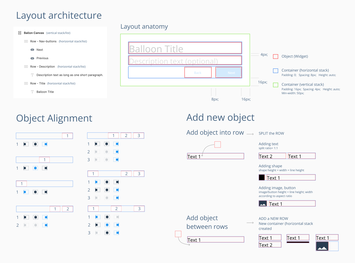
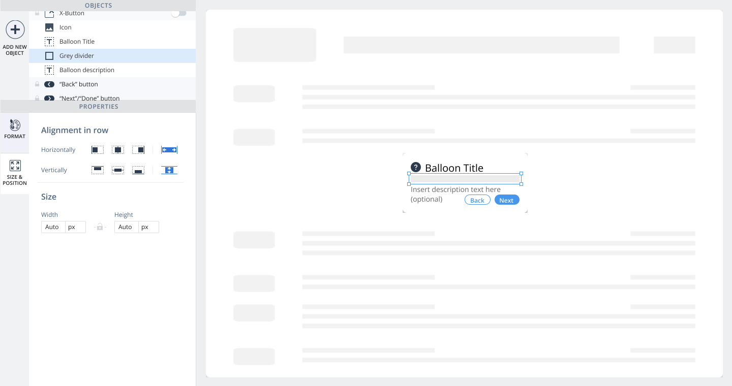
The second version introduced auto-layout: objects organized into rows and stacks, with spacing governed by rules instead of coordinates. It covered roughly 80-90% of what users actually did, and inside that range the outcome became predictable - far fewer ways to place something that would break on another screen.
Absolute positioning stayed. Advanced users kept working with it, as did anyone whose case auto-layout could not express. The two modes coexist; the second never replaced the first.
Stack-based layout was reaching mainstream design tools at roughly the same time. Ours had to carry more, because its output had to run rather than merely display - and because the person operating it was not a designer.
06
Adding objects to the canvas
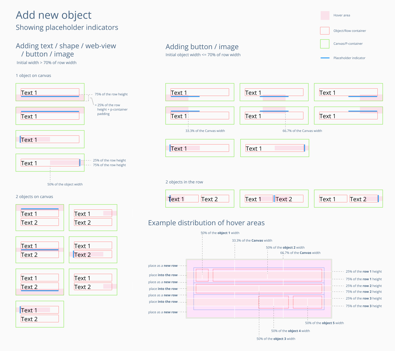
Getting an object onto the canvas received disproportionate attention, because that first action is where a non-designer forms their model of how the whole tool works.
Objects could be added from the element panel or directly on the canvas, and the canvas showed where one would land before it was placed - hover zones divided each row and container, so both the drop position and the resulting behavior were visible in advance instead of discovered afterwards.
07
What testing changed
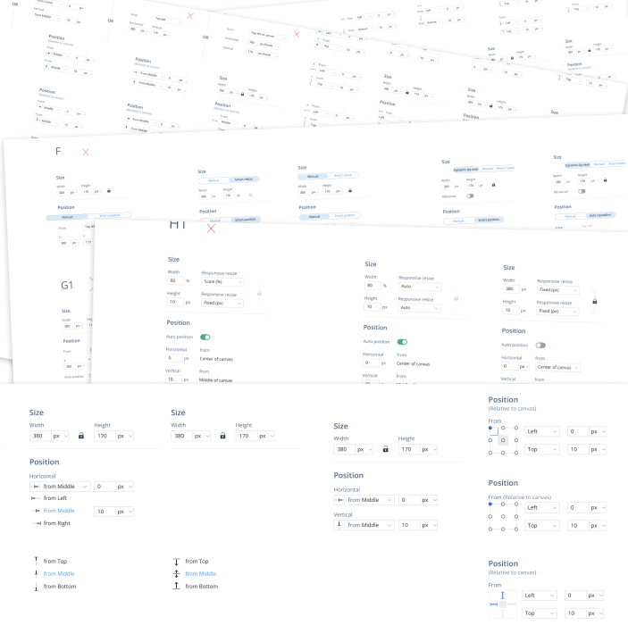
Nearly every control went through usability testing. Positioning controls were benchmarked against Sketch, Adobe XD, early Figma, and web page builders.
Those tools assume a design-trained user, and several of their conventions failed with ours. Where that happened we chose the less graphical, more explicit option, which tested better every time.
Two results are worth recording, because both went against a reasonable expectation.
The navigation panel. We first used a dark side panel for section navigation, the prevailing convention then. It tested worse than a light one sharing the palette of the working area: in an integrated tool, the color break read as a boundary between two separate things, and it cost users sight of what the platform could do.
Positioning shortcuts. The panel offered quick-action buttons for common placements, with a detailed interface underneath for everything else. Internal testing supported it; it held up through release.
Real usage did not. Two routes to the same result were the source of the confusion, not a convenience. We removed the shortcuts, and comprehension and satisfaction rose more than we expected from taking capability away.
08
Development and design QA
Approved designs went into implementation across the three platforms, each with its own design QA pass. The recurring judgment call was where to spend simplicity: the tool had to stay operable by a product manager while giving a designer enough room to build something exact.
Outcome
The editor gave non-designers a level of control the category did not otherwise offer. Sales reported that prospects, shown it in demos, said no other vendor had an equivalent.
Years later I checked from the other side. Evaluating adoption platforms as a buyer at Sisense, I tested WalkMe against several industry leaders. Its core had changed little since I left, and was still unmatched in flexibility.
We were also early, though not by design. Major design tools reached comparable layout maturity about a year after we shipped; design-to-code took years longer. That came from necessity: our output had to run inside someone else’s application, on devices we could not predict. Behavior control was not a refinement here, it was the requirement.
The lesson was narrower than “test your work”: a solution validated internally can still fail on contact with real users, and the failure is often not in any single control but in offering two routes to one result. Removing capability made the tool better.